Getting Started with UI Design
Add to favorites
Design your first iOS app using the best practices in UI design
Play video
UI Design Quick Apps in Figma
1
Getting Started with UI Design
22:33
2
Food App UI Design
10:43
3
Meditation App Glassmorphism UI Design
15:18
4
Bitcoin App Glassmorphism UI Design
46:06
5
Dark UI Design
13:30
6
Glassmorphism, Components and Design System
19:45
7
Soft UI Design
16:35
8
Dark Mode NFT app Part 1 - Card with blurred background
9:45
9
Dark Mode NFT app Part 2 - Cards with outline
8:13
10
Dark Mode NFT app Part 3 - TabBar
7:43
11
Dark Mode NFT app Part 4 - Segmented Control
11:59
12
Dark Mode NFT app Part 5 - List
7:56
13
Neon UI Design Part 1 - Screen 1
11:53
14
Neon UI Design Part 2 - Screen 2
16:42
15
Neon UI Design Part 3 - Screen 3
19:24
16
Dark Neumorphism Tesla app Part 1 - Neumorphic Button
8:41
17
Dark Neumorphism Tesla app Part 2 - Nav bar
9:22
18
Dark Neumorphism Tesla app Part 3 - Control Menu & Table view
12:36
19
Dark Neumorphism Tesla app Part 4 - Tab bar
8:33
20
Dark Neumorphism Tesla app Part 5 - Temperature Progress bar
8:49
21
Dark Neumorphism Tesla app Part 6 - Temperature Slider
8:42
22
Dark Neumorphism Tesla app Part 7 - Control setting with background blur
6:37
23
Dark Neumorphism Tesla app Part 8 - Battery with neon light effect
11:13
24
Dark Neumorphism Tesla app Part 9 - Dropdown table row
11:21
25
Social Media App Part 1 - Profile Screen
13:26
26
Social Media App Part 2 - Home Screen
17:09
27
Social Media App Part 3 - Chat Screen
11:38
28
Weather App Part 1 - Bottom sheets
16:52
29
Weather App Part 2 - TabBar
11:49
30
Weather App Part 3 - Weather Widget
8:59
31
Map app Part 1 - Custom Nav Bar with 3D Effect
12:06
32
Map app Part 2 - Map and Navigation Detail
9:27
33
Map app Part 3 - Mileage Chart
9:22
34
Map app Part 4 - Map List and Tab Bar
15:41
35
Movie Ticket Booking App Part 1 - Reservation Screen
16:38
36
Movie Ticket Booking App Part 2 - Seats Screen
20:38
37
Movie Ticket Booking App Part 3 - Tickets Screen
20:01
38
Wallet App Part 1 - Transactions Screen
21:36
39
Wallet App Part 2 - Cards Screen
17:12
40
Wallet App Part 3 - Statistics Screen
14:09
41
Bike Shopping App Part 1 - Discover Screen
13:27
42
Bike Shopping App Part 2 - Detail Screen
8:14
43
Bike Shopping App Part 3 - Cart Screen
9:41
44
Cab Booking App Part 1 - Chosen Ride Screen
18:33
45
Cab Booking App Part 2 - Destination Screen
14:36
46
Cab Booking App Part 3 - Driver Screen
8:29
47
Flight Booking App Part 1 - Homepage
16:28
48
Flight Booking App Part 2 - Book Your Flight
11:57
49
Flight Booking App Part 3 - Select Your Flight
10:29
50
Flight Booking App Part 4 - Boarding Pass
13:06
Figma file
https://www.figma.com/file/E9lCE1aAncYXE55UOxQtlV/Meditation-App?node-id=0%3A1
Learn iOS UI Patterns
Before you start pushing pixels, you should have a sense of what you’re designing and quickly recognize the most common patterns on iOS. UI Design is less scary when you know how to categorize screens, how to name things and where to place UI elements in a way that it makes sense.
This is a skill that pretty much everyone with a phone is gaining on a daily basis, whether they’re conscious of it or not. Your brain starts to make patterns of where a menu should be or how to navigate back to the Home screen. Being a UI designer means that you’re consciously organizing that information. To help with that task, you can start collecting screenshots of your favorite apps or browse from thousands: Mobbin.design

Mobbin. lets you browse thousands of real apps by categories, UI patterns, elements and colors.
While it’s important to be realistic with your designs, it is no secret that most designers will gain far more attention by pushing new concepts. Dribbble is an excellent source of inspiration.
Learn the iOS Guidelines
To learn a new craft, most people will tell you to read a book. While it’s a sure way to gain new knowledge, a vast majority will lack motivation to continue past a couple of pages. That’s why it’s important to have a game plan. Where should you start, in what order and what is the balance between reading and executing? Well, my suggestion is to start with colors and typography on the iOS Human Interface Guidelines, in that order. Don’t read more than what you can apply.
You can also get a more engaging overview by reading this one page covering the most important aspects of the iOS Design Guidelines.
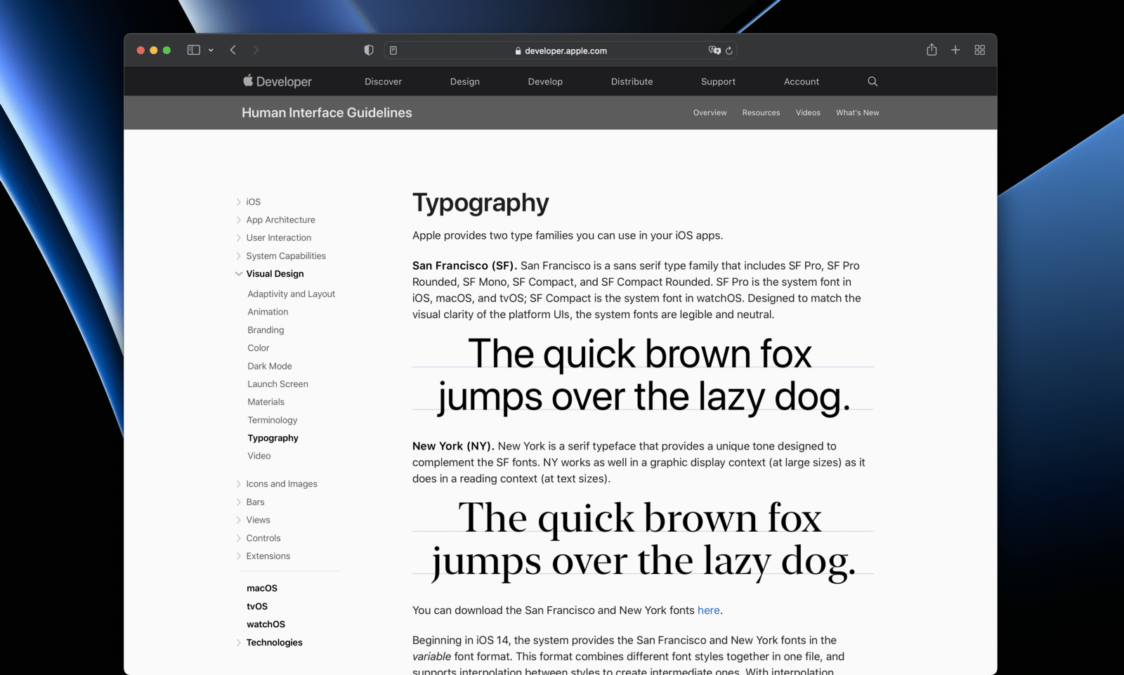
Pick a Design Tool
Picking the right design tool is essential for starting as painlessly as possible. In 2022, Figma is easily the most sensible choice. It’s free without time limit, has the most vibrant community in-app for templates & plugins and is the most cross-platform supporting Windows, Mac and even the browser. You share your design with an URL and anyone in the world can view it. It’s so good that many designers nowadays are including Figma links in their resume/portfolio.

Download iOS UI Kits and Templates
When you’re beginning, your job shouldn’t be to design everything from scratch. Your role is to put things together in a way that’s delightful and follow the vision of your app. This means starting from existing templates and assets. At the very least, you should get familiar with the iOS 15 UI Kit by Apple. It’s made for Sketch, but you can import it to Figma with a few issues.

For full components, variants and auto layout support, I high recommend Joey Banks’ iOS 15 UI Kit for Figma. Additionally, you the Figma Community is full of iOS design templates that you can download and edit. One of the best ways to learn is to analyze works from others.
Download iOS Fonts
For many apps, the texts represent at least 50% of the visual on the screen. That’s why it’s important to learn the basics of typography. In iOS, we’re lucky to have San Francisco, a system font designed by Apple from the ground up with multiple variations: SF Pro for iOS, SF Compact for Apple Watch and other variations like SF Pro Rounded, SF Mono, SF Arabic and New York.
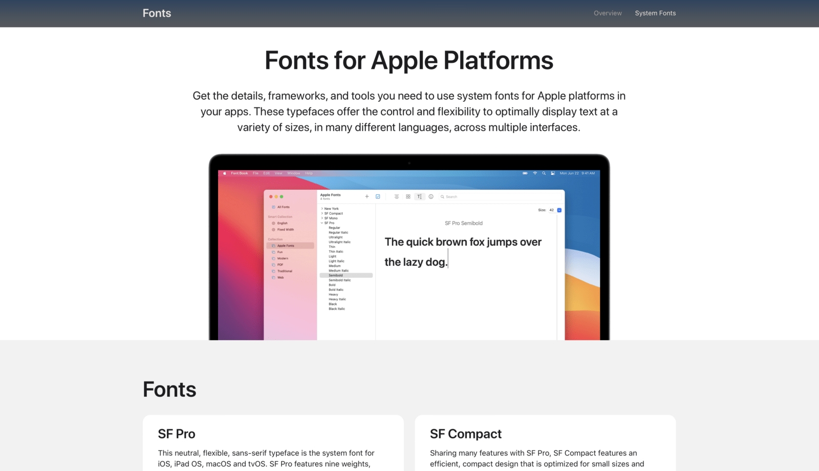
As you gain experience, you want to experiment with more fonts and learn font pairing. For that, Google Fonts has the largest selection of free fonts. Moreover, they’re automatically available in Figma out of the box.
Transcript
Hey guys, my name is Meng I'm from design plus code. And today I'm going to show you how to build a very simple from scratch. And I'm going to show you some of the basic techniques that most designers, even if you don't have any experience doing design, this should be super useful for you. The first thing I want to show you is the ideation, meaning that what is the app that you're gonna build?
The first thing you want to do is to browse some ideas. Those are typically your most used app when you use iOS, when you use the app store, what do you download? And typically you want to imitate an app that you use yourself. So for example, a weather app, a fitness app or a health tracking. Or a Bitcoin app, if you're into crypto. In term of the ideation use the most common app that most people use. Now let's talk about UI patterns and inspiration. You should go to dribbble because dribbble is where all the best designers in the world they meet and they build very cool experiments in term of animations and basic UI.
And also there's a website I like to use is called Mobbin.design and in term of UX, if you don't know what UX is, it's when. You talk about the experience? Like, is it a signup page? What is the pattern? Where should you put the button? What is the menu is going to look like.
So for example, you look at some of the popular apps such as balance or target or whatever. You're going to see the different categories of apps, such as education. You're going to need to create an account. And then you search by patterns, category, for example, PayPal, or what does it look like? What kind of screens that we have for PayPal? So here, in term of UX, you have to be able to identify, what are these patterns and what are the most common type of screens that we see of these app?
This for example is called user onboarding screens. And the user onboarding is when you land on the app, and it's explaining to you what this app is all about. For example, you can see here, it has beautiful graphics and it has some texts, a title, and some dots in it shows you, you can log in, you can sign up and this is super easy to design.
I would probably start with this if you're a beginner, because it allows for more creativity versus, the in-app screen such as entering a cell phone is typically more boring. So, if you want to use your creativity, definitely onboarding is a pretty good pattern to start with.
You can see, Dharma, I don't really know this app, but you can see that you have a bunch of patterns and you can use your creativity. So honing in on what app you want to build, what screens you want to build. This is what I would do and then getting more into the details.
Right? So what fonts should you use? If you're starting out, you should definitely use San Francisco, because it's a system font. If you're building for Android, it should be Roboto and if you want to be more adventurous, which I do not recommend, if you have very little experience in UI design, for example, I would go with the safer route, like Roboto which is for Android and Spline Sans or something that is safer. Something that is readable and easy to digest, such as Poppins Montserrat. Or you can search in Google for like top fonts for UI design.
Typically you're going to find a nice list of fonts that you should use that is recommended by most designers. And so that's what I would do because typography represents about 90% of every UI design. That's why the font is so important now let's go into more details. Apple design resource.
If you're building an iOS app design, then you want to use something like a sketch library. You want to download for iOS. You're going to have like basic patterns in term of the iOS language and you want to be consistent with the platform so that what you design is not completely different and respect the rules.
So you want to learn also the iOS design guidelines. Okay. And of course there's a lot of stuff that you're going to want to read, but the main thing you want to read about is visual design and colors. So colors, just pick whatever one of these colors, and then you want to go into, maybe material if you want to go.
But typically colors and typography are the two most important things that you need to know as a beginner. That's it right. You don't want to read the whole thing. You're going to get bored. You're going to sleep. You want to start very, very simple. And then, once you have these resources, you can head to Figma and you're going to go to the community and you're going to start searching for some of these examples that you can explore and analyze.
But most importantly, you should definitely start with the iOS 15 UI kit and this is a great one that you should definitely download. And you're going to be able to look at all of the components that comes with it. The same way you can use the one by apple. You can also get this one, which is created by the community, and it has every single detail to create that design that you want.
Sure. You're a designer. You want to get more creative? This might be a little bit too boring and too normal. But when you do UI design, you have to understand that there's two facets of it, the creative part and the UX part. And you have to master both. You can't just think, okay, let's go crazy and just do something with a ton of colors, a ton of artworks.
It doesn't make any sense because then you don't think about the functionality you don't think about, how it's going to affect the user experience and what are the design systems, the fonts, the topography, the colors, and how do you ship that to engineers so that they understand what you're trying to achieve with your design.
So that's why you need to look at this at a glance and apply that to your design. Some of the interesting things to look at is the color system. For example, we have the colors for dark mode and light mode and the home screen, the typography it's pretty important to understand these from a basic level.
So, the most three important is large title and then body. And then if you want to go smaller then footnote or caption, and then if you want to have more variation to the title, then you have the title 1, 2, 3.
In every single screen, you're going to see the body text and the large title. Those are the two most important things. And sometimes you have the variation with the bold and non bold. So going back to the community, we're going to have a bunch of UI that you should look at.
You can build a website or you can build an app. If you're starting out, I would suggest building an app because an app is way easier. You have a smaller screen, it's more interesting. You can show it to people instead of asking them to go to your computer.
It's also much easier with Swift UI to start an app and put that on your phone versus building a website and then dealing with a lot of platforms unless you're using code sandbox. But then again, code sandbox is more for experimentation. Then you have to pay for services like Netlify and stuff like that.
Making an app it's a lot easier. You should download some of these screens such as iOS design, so you can see, we have a bunch of examples here, and you can see that it always start with just one or two screens don't complicate things. Go with what excites you give yourself a deadline.
Don't try to spend like a month because you will lose hope you will want to quit. You will want to give up and that's not good. So you can see most of these designs, for anyone who has a bit of experience, take may maybe maximum a day to design and If you have more experience it should take an hour or two.
When it comes to UI design, you're not supposed to do most things from scratch. A UI designer's job is not to create icons and backgrounds and illustrations from scratch. Their job is to mix things together so that the user experience makes sense that people can use it.
And so that is the goal. That is what you should be focusing on. What is the typography? What are the colors for the branding? What is the menu looking like?
And so that's basically, it let's put that into practice. We're going to create a new design file. So let's take a look at one of the super simple screens. You have this one. Or this one, so onboarding screen and then main screen to screen, super simple for someone who has a little bit more experience is probably taken an hour.
And for someone who has less experience probably is going to make multiple iterations and probably take a day or two. But this is not from an execution standpoint, this is not complicated.
So you're going to create a screen and iPhone 13. And so you're going to want to go to this design kit.
Why? Because we need some of the basic components such as the tab bar. So their status bar and home indicator, you're going to want to go to the team library and publish this. And once I have that, I'm going to be able to go and enable that such as this one.
And I'm going to be able to search for this status bar and I'm going to bring that to my UI design, adjust that. So now I have this, and then I also want the home indicator and voila right? So every screen is going to look like this from a base level. What is it I'm going to build. I don't know, meditate, so that you feel less stressed.
I'm just inventing on the fly and this is my title. Because it's iOS. You want to make it big enough. And typically you need to know what are the size. And, back to the large title is you should know by heart, which is about 34. And also a title is typically bold or heavy. If you know some of the rules it's San Francisco pro display and depending on the screen, sometimes you can afford to have bigger title.
This 34 titles is mostly for a typical screen with a navigation controller at the top. But otherwise you can get like into 50 even. Like this. Super simple UI design. And then what else? You need illustrations? So illustrations, you can get it from, a website like shape, or you can also get it from the Figma community.
Let's search for illustrations. We are so lucky because so many of these things are just free for us and you can duplicate this let's just use one of these illustrations. For the purpose of the, this example, let's use this one and resize this boom. There you go. I have my onboarding screen right.
Now I just need my triple dots. I don't know if it's called dots but, I'm going to duplicate this, right?
So this one is not selected. I don't know. Boom. If this is lacking contrast, you can always add a little bit of color. And, you can make a little gradient, right? And you can switch the gradient. And now we have contrast with both light and dark. And if you want to feel more adventurous, which again, depending on your level of experience, you can add colors.
Let's say you want to use one of the iOS colors. So, let me go here and I'm going to use a, maybe not something super flashy, but let's say this blue, which is super popular as a color in iOS. I can put that as a background and then boom, I have something a little bit more colorful. To contrast well, I can make it white and the same for the label for the status bar so we can choose light mode, dark mode. And that is all thanks to the UI kit. And so here, obviously we don't want to use gray. We want to use black or white, and we also want to use transparency so that it fits better against any color.
So now we have something that looks a little bit better, also the spacing between these, we can use auto layout. So let me group these together, I'm going to add auto layout and then I can control the spacing to let's say 12. And as you get better with UI design you know the basics of spacing such as using the four point grid or the eight point grid.
But again, you don't need to know those things as a beginner, don't worry about it. So that's the first screen. The second screen is the browse screen, right? So if we go back to our inspiration, the first rule of designing is to not copy everything.
So you're allowed to copy the UX. When I say the UX, like where things are placed, you're supposed to copy the UX because the tab bar is always at the bottom. The buttons are always at the top right or top left. And, this is what an onboarding screen looks like. You're supposed to copy that.
What you're not supposed to copy is exactly the same colors, the same text, the same illustration. You're not allowed to do that. So if I'm looking here, you can see that. Okay. So I have a top bar, it has a bunch of icons. I have the menu here and I have my layout here. I have my button here, so let's do that.
I'm going to remove this. And all I need to do is use one of the icons. So what do I use for icons? I can use, if I want to be consistent to iOS, I can use SF Symbols, which has so many icons for free by apple.
And so I can use. And I can copy this and you need to make sure to use SF pro. Otherwise it's not going to work. So we're going to paste that and you're going to use the font size to about 17, which is the body size. And boom. So this is typically your typical size icon, but you can make it bigger if you don't have a text, but I would definitely suggest to have the text, but let's say for the purpose of this demo, we don't have a text.
We want to be a little bit more creative. We're going to have about three icons like this, and we want to use auto layout. Boom. And it's consistently space 80. We want to send to this and then we're going to have like different icons, such as let's say grid.
I don't know something like this. Boom. And then search. There we go. Boom. My menu is there. You can have a different colors for the background, black or white. You can also play with different shades of gray. So for example, you have a top bar that is of different colors, so you want to use a visual hierarchy for that.
You can have a background for your tab bar that is a little bit lighter, make sure that it's very subtle, just like in real life. When you look at things, it's not like super contrast, it's very subtle. The shadows, the tone. And, I'm going to make that below and I'm gonna set it to about 5% or even 10% using white, or let's say 5%.
There you go. You have the menu that has a little bit of accent. Here we can set the card for the content. We can also have the button. So the button, you should know a little bit about the rules such as, what is the size. So what I recommend is to look at the UI kit and measure things.
Once you measure things, you're going to have a lot more confidence in term of what is this going to look like in term of size? So for example, this action button, which is supposed to take more space is about 60 in term of height. But this one is 42. Now the magic number for iOS is 44. And, that is the average, because of the size of the fingers, we want to be able to use it properly.
So going back to my design, I'm going to set this to about 50 or 60, and I want to also have maybe some rounded corners. So 20, you can also use the iOS rounded corners. So this is the super ellipse as we call them, you can set it to 60 and then you can use the same color or you want to make it more poppy, depending on the importance of that button.
And then you set a button. So for example, sign up and, depending on the size of the button, it's going to be more or less. You can also use the text styles. If you have used that as a library from iOS, you can use the text style from iOS, so you can use, something like headline, or you can use title three and there you go.
This is for the button. Sign up for free can set it to centering. And also, you can set this as auto layout as well. And orderly out. What is cool about that is that you can change the size to always be consistent. So for example, if I want a padding to always be 10, 10 from top to bottom, and if I want the size of the button to always have a consistent spacing, such as 10 30, 30. Then whenever I changed the size of the text, it's going to auto expand by default.
And that's really cool. But in this case, my button is always going to be the same size, but I just wanted to show you that this is possible. And these are some of the cool techniques. We can also add drop shadows to the button. So like this, and you can use maybe a 20 and 10. So now you have a little bit of a glow, and now we have the content that you can use.
You have different types of content that you can browse. So, we can set it to 20 and here I'm going to set it to black for now. So this is my content and I can have some illustrations to be part of that content. And then I'm going to make it bigger. So that it fits for each of those cards
like this. And then you have some title, when I'm short on time, I like to copy and paste. As you can see here, don't worry. And it's always about how much time that you have in front of you. If the text is supposed to be a title or a body text in this case, because it's part of a card, then it's going to be a title and you want to use the bold version. So it's going to be title one. You want to align it to the left and something like this, and boom, I'm going to make this below.
And then, sometimes you have a second text, and now I'm going to use the body text and it's not going to be bold. Typically a body text is not bold. And so it's going to look like this.
Also, you want to use different colors between the title. You can also use transparency 70%. For example. Now we have a bit of a difference in hierarchy between the two. And it's gonna look a little bit like this. You can group everything together. This is now a card, and once you have a card, you can really change that card the way you want. And so depending on your content, it's going to look more or less like this. And of course you can use auto layout. So we don't end up with a problem like this. You can see with auto layout, I'm going to be able to do this. And then when it resize, it's less, problematic.
You know of the card, you can make it, depends how many cars do you want to show? If you have more cards to show, maybe you want to use cards next to each other like this, and if you have less cards, then you want to make cards next to each other like this. This depends on all of those factors.
This is definitely exceeding so you can use a mask. So I'm going to use as a mask. The problem with the mask can not have a background color. So I'm going to have to duplicate that and these able to mask and have two layers.
One is a mask and one that is not, and now I have a perfectly size card. So second card, and maybe I'm going to make these ones smaller cards. Don't want to get too much into the details. Those are the kinds of things that you can work with and you can definitely change the illustrations.
And what is missing is the titles.
And this time, cause it'd be like maybe title three and latest uploads.
There you go. And you don't have to use always the same color. And when the card is smaller, you can use a smaller title such as this is going to fit a lot better. But you have to be consistent, right? You can't just have a different structure, every single card. So if this size for the text is 125 then this size for the text also 125.
So I can also use 75 opacity. And there you go.
I'm going to put the tab bar to be in front. Make sure that I also have the background with me, because I'm using opacity, it's not showing correctly. So I'm going to use the eyedropper and there you go. You have two screens made in 15 minutes and you learn how to come from ideation to resources, to studying and then creating something from scratch.
Templates and source code
Download source files
Download the videos and assets to refer and learn offline without interuption.
Design template
Source code for all sections
Video files, ePub and subtitles
Videos
Subtitles
Assets
1
Getting Started with UI Design
Design your first iOS app using the best practices in UI design
22:33
2
Food App UI Design
Learn how to design simple screens for a food app in the Figma design tool
10:43
3
Meditation App Glassmorphism UI Design
Learn how to design onboarding screens for your first app
15:18
4
Bitcoin App Glassmorphism UI Design
Create a user interface of a crypto app from scratch by combining Neomorphism and Glassmorphism
46:06
5
Dark UI Design
Learn how to design dark UI design in the Figma design tool
13:30
6
Glassmorphism, Components and Design System
Meditation app part 2 with Explore Screen and design system
19:45
7
Soft UI Design
Learn how to create a beautiful user interface from scratch using soft drop shadows, inner shadows and vibrant colors
16:35
8
Dark Mode NFT app Part 1 - Card with blurred background
Learn to design an NFT marketplace app by combining overlays with the Glassmorphism style
9:45
9
Dark Mode NFT app Part 2 - Cards with outline
Learn to create a card with a blurred background using an overlay outline
8:13
10
Dark Mode NFT app Part 3 - TabBar
Learn how to create a custom tab bar using overlay glassmorphism
7:43
11
Dark Mode NFT app Part 4 - Segmented Control
Learn how to create segmented controls and buttons with glassmorphism style
11:59
12
Dark Mode NFT app Part 5 - List
Learn how to design a list with rows
7:56
13
Neon UI Design Part 1 - Screen 1
Learn how to create a lighting and glowing user interface from scratch using neon style
11:53
14
Neon UI Design Part 2 - Screen 2
Learn how to create a lighting and glowing user interface from scratch using neon style
16:42
15
Neon UI Design Part 3 - Screen 3
Learn how to create a lighting and glowing user interface from scratch using neon style
19:24
16
Dark Neumorphism Tesla app Part 1 - Neumorphic Button
Learn to design a Dark Neumorphism button effect
8:41
17
Dark Neumorphism Tesla app Part 2 - Nav bar
Learn to create navigation bar and use remove background trick to get png image
9:22
18
Dark Neumorphism Tesla app Part 3 - Control Menu & Table view
Learn how to create Control menu and table view using auto-layout frame
12:36
19
Dark Neumorphism Tesla app Part 4 - Tab bar
Learn how to create a custom tab bar with the curve and neon light effect
8:33
20
Dark Neumorphism Tesla app Part 5 - Temperature Progress bar
Learn how to create temperature progress bar using ellipse tool and arc tool.
8:49
21
Dark Neumorphism Tesla app Part 6 - Temperature Slider
Learn how to create temperature bar
8:42
22
Dark Neumorphism Tesla app Part 7 - Control setting with background blur
Learn how to create the control setting with background blur
6:37
23
Dark Neumorphism Tesla app Part 8 - Battery with neon light effect
Learn how to create battery control with neon light effect
11:13
24
Dark Neumorphism Tesla app Part 9 - Dropdown table row
Learn how to create a drop down table row
11:21
25
Social Media App Part 1 - Profile Screen
Learn how to create a social media app design, we will start the profile screen
13:26
26
Social Media App Part 2 - Home Screen
Learn how to create a social media app design by desigining the home screen
17:09
27
Social Media App Part 3 - Chat Screen
Learn how to create a social media app design by designing the chat screen
11:38
28
Weather App Part 1 - Bottom sheets
Learn how to create a modal bottom sheets with glassmorphism
16:52
29
Weather App Part 2 - TabBar
Learn how to create a custom tab bar
11:49
30
Weather App Part 3 - Weather Widget
Learn how to create a weather widget
8:59
31
Map app Part 1 - Custom Nav Bar with 3D Effect
Learn how to create 3d triangle buttons with custom shape,background with blur and navigation description
12:06
32
Map app Part 2 - Map and Navigation Detail
Learn how to create the navigation system
9:27
33
Map app Part 3 - Mileage Chart
Learn how to create a mileage chart status
9:22
34
Map app Part 4 - Map List and Tab Bar
Learn how to create a map list and custom tab bar with neon light effect
15:41
35
Movie Ticket Booking App Part 1 - Reservation Screen
Learn how to design a movie ticket booking app by starting with the reservation screen
16:38
36
Movie Ticket Booking App Part 2 - Seats Screen
Learn how to design our seats screen for our movie ticket booking app
20:38
37
Movie Ticket Booking App Part 3 - Tickets Screen
Learn how to design our tickets screen for our movie ticket booking app
20:01
38
Wallet App Part 1 - Transactions Screen
Learn how to design a wallet app by starting with the transactions screen
21:36
39
Wallet App Part 2 - Cards Screen
Learn how to design a wallet app by designing a cards screen
17:12
40
Wallet App Part 3 - Statistics Screen
Learn how to design a wallet app by designing a statistics screen
14:09
41
Bike Shopping App Part 1 - Discover Screen
Learn how to design a bike shopping app design with neumorphism style and matte effect
13:27
42
Bike Shopping App Part 2 - Detail Screen
Design the detail screen for our bike shopping app
8:14
43
Bike Shopping App Part 3 - Cart Screen
Design the cart screen for our bike shopping app
9:41
44
Cab Booking App Part 1 - Chosen Ride Screen
Learn how to design a cab booking app using the neumorphism style
18:33
45
Cab Booking App Part 2 - Destination Screen
Design a destination screen for our cab booking app
14:36
46
Cab Booking App Part 3 - Driver Screen
Design a driver screen for our cab booking app
8:29
47
Flight Booking App Part 1 - Homepage
Learn how to design the homepage for a flight booking app
16:28
48
Flight Booking App Part 2 - Book Your Flight
Learn how to design a booking section for a flight booking app
11:57
49
Flight Booking App Part 3 - Select Your Flight
Learn how to design the selecting flight section for a flight booking app
10:29
50
Flight Booking App Part 4 - Boarding Pass
Learn how to design a boarding pass for a flight booking app
13:06
Meet the instructor
We all try to be consistent with our way of teaching step-by-step, providing source files and prioritizing design in our courses.
Meng To
I design, code and write
Meng To is the author of Design+Code. Meng started off his career as a self-taught designer from Montreal and eventually traveled around the world for 2 years as his US VISA was denied. During his travels, he wrote a book which now has 35,000 readers.
39 courses - 184 hours

Build SwiftUI apps for iOS 18 with Cursor and Xcode
In this course, we'll explore the exciting new features of SwiftUI 6 and Xcode 16 for building iOS 18 apps. From mesh gradients and text animations to ripple effects, you'll learn how to create polished, highly custom apps using the latest workflows. We'll also dive into using Cursor and Claude AI for AI-driven coding, helping you start strong and customize your apps.
5 hrs

Create your Dream Apps with Cursor and Claude AI
Learn to build your dream web apps from the ground up using Cursor, Claude AI, and a suite of powerful AI tools. This course covers everything you need, including React for frontend development, Firebase for backend integration, and Stripe for handling payments. You’ll also dive into advanced AI tools like Claude Artifacts, Galileo AI, v0.dev for UI, Ideogram for design generation, and Cursor Composer for full-scale development.
6 hrs

Build a React Site from Figma to Codux
In this course, you'll learn to build a website from scratch using Codux, starting with a Figma template. You’ll master responsive design, collaborate with developers on a real React project, export CSS from Figma using Locofy, set up breakpoints with media queries, add CSS animations, improve SEO, create multiple pages with React Router, and publish your site. By following best practices, you’ll bridge design and development, improve your web design skills.
2 hrs

Create 3D UI for iOS and visionOS in Spline
Comprehensive 3D Design Course: From Basics to Advanced Techniques for iOS and visionOS using SwiftUI
3 hrs

Master No-Code Web Design with Framer
In this free Framer course, you'll learn to create modern, user-friendly interfaces. Start with dark mode and glass designs, then move from Figma to Framer, using vectors and auto layout for responsive websites. Add animations, interactive buttons, and custom components with code. Finally, you'll craft a design system suitable for teamwork or solo projects, all in a straightforward and practical approach.
4 hrs

Build SwiftUI Apps for iOS 17
In this course, we’ll be exploring the fresh and exciting features of SwiftUI 5! As we craft a variety of iOS apps from the ground up, we'll delve deep into the treasure trove that is SwiftUI's user interface, interactions, and animations.
4 hrs

Build Beautiful Apps with GPT-4 and Midjourney
Design and develop apps using GPT-4 and Midjourney with prompts for SwiftUI, React, CSS, app concepts, icons, and copywriting
4 hrs

Build SwiftUI apps for iOS 16
Create animated and interactive apps using new iOS 16 techniques using SwiftUI 4 and Xcode 14
5 hrs

Build a 3D Site Without Code with Framer
Design and publish a responsive site with 3D animation without writing a single line of code
3 hrs

Create 3D Site with Spline and React
Design and code a landing page with an interactive 3D asset using Spline and CodeSandbox
1 hrs

Build an Animated App with Rive and SwiftUI
Design and code an iOS app with Rive animated assets, icon animations, custom layouts and interactions
3 hrs

Build a SwiftUI app for iOS 15 Part 3
Design and code a SwiftUI 3 app with custom layouts, animations and gestures using Xcode 13, SF Symbols 3, Canvas, Concurrency, Searchable and a whole lot more
4 hrs
Build a SwiftUI app for iOS 15 Part 2
Design and code a SwiftUI 3 app with custom layouts, animations and gestures using Xcode 13, SF Symbols 3, Canvas, Concurrency, Searchable and a whole lot more
3 hrs

Build a SwiftUI app for iOS 15
Design and code a SwiftUI 3 app with custom layouts, animations and gestures using Xcode 13, SF Symbols 3, Canvas, Concurrency, Searchable and a whole lot more
4 hrs

React Livestreams
Learn how we can use React Hooks to build web apps using libraries, tools, apis and frameworks
4 hrs
Design Founder Livestreams
A journey on how we built DesignCode covering product design, management, analytics, revenue and a good dose of learning from our successes and failures
2 hrs

SwiftUI Advanced Handbook
An extensive series of tutorials covering advanced topics related to SwiftUI, with a main focus on backend and logic to take your SwiftUI skills to the next level
4 hrs
iOS Design Handbook
A complete guide to designing for iOS 14 with videos, examples and design files
2 hrs

SwiftUI Handbook
A comprehensive series of tutorials covering Xcode, SwiftUI and all the layout and development techniques
7 hrs

Build a web app with React Hooks
Learn how we built the new Design+Code site with React Hooks using Gatsby, Netlify, and advanced CSS techniques with Styled Components.
4 hrs

UI Design Handbook
A comprehensive guide to the best tips and tricks for UI design. Free tutorials for learning user interface design.
2 hrs

Figma Handbook
A comprehensive guide to the best tips and tricks in Figma
6 hrs

SwiftUI for iOS 14
Build a multi-platform app from scratch using the new techniques in iOS 14. We'll use the Sidebar and Lazy Grids to make the layout adaptive for iOS, iPadOS, macOS Big Sur and we'll learn the new Matched Geometry Effect to create beautiful transitions between screens without the complexity. This course is beginner-friendly and is taught step-by-step in a video format.
3 hrs

SwiftUI Livestreams
This is a compilation of the SwiftUI live streams hosted by Meng. Over there he talks and teaches how to use design systems, typography, navigation, iOS 14 Design, prototyping, animation and Developer Handoff.
19 hrs

UI Design Livestreams
This is a compilation of the UI live streams hosted by Meng. Over there he talks and teaches how to use design systems, typography, navigation, iOS 14 Design, prototyping, animation and Developer Handoff.
26 hrs

UI Design for Developers
In this course we'll learn how to use design systems, set up break points, typography, spacing, navigation, size rules for adapting to the iPad, mobile and web versions, and different techniques that translate well from design to code.
3 hrs

Build an app with SwiftUI Part 3
This course was written for designers and developers who are passionate about design and about building real apps for iOS, iPadOS, macOS, tvOS and watchOS. SwiftUI works across all of those platforms. While the code is not a one-size-fits-all, the controls and techniques involved can apply to all platforms. It is beginner-friendly, but it is also packed with design tricks and cool workflows about building the best UIs and interactions.
4 hrs

Build an app with SwiftUI Part 2
This course was written for designers and developers who are passionate about design and about building real apps for iOS, iPadOS, macOS, tvOS and watchOS. SwiftUI works across all of those platforms. While the code is not a one-size-fits-all, the controls and techniques involved can apply to all platforms. It is beginner-friendly, but it is also packed with design tricks and cool workflows about building the best UIs and interactions.
4 hrs
Build a full site in Webflow
Webflow is a design tool that can build production-ready experiences without code. You can implement CSS-driven adaptive layouts, build complex interactions and deploy all in one tool. Webflow also comes with a built-in content management system (CMS) and Ecommerce for creating a purchase experience without the need of third-party tools.
3 hrs

Advanced Prototyping in ProtoPie
ProtoPie is a cross-platform prototyping tool that creates prototypes nearly as powerful as those made with code, with half of the efforts, and zero code. It's perfect for designers who want to quickly experiment with advanced interactions using variables, conditions, sensors and more.
3 hrs

Build an app with SwiftUI Part 1
This course was written for designers and developers who are passionate about design and about building real apps for iOS, iPadOS, macOS, tvOS and watchOS. SwiftUI works across all of those platforms. While the code is not a one-size-fits-all, the controls and techniques involved can apply to all platforms. It is beginner-friendly, but it is also packed with design tricks and cool workflows about building the best UIs and interactions.
4 hrs

React Native for Designers Part 2
React Native is a popular Javascript framework that builds on top of React by using native components to create a real mobile app indistinguishable from one made using Xcode or Android Studio. The main difference with native development is that you get to use CSS, hot-reload, Javascript and other familiar techniques that the Web has grown over the past decades. Most importantly, you're building for both iOS and Android using the same codebase.
3 hrs

React Native for Designers
React Native is a popular Javascript framework that builds on top of React by using native components to create a real mobile app indistinguishable from one made using Xcode or Android Studio. The main difference with native development is that you get to use CSS, hot-reload, Javascript and other familiar techniques that the Web has grown over the past decades. Most importantly, you're building for both iOS and Android using the same codebase.
5 hrs

Design System in Figma
Learn how to use and design a collaborative and powerful design system in Figma. Design Systems provide a shared library of reusable components and guidelines and that will let you build products much faster
3 hrs

React for Designers
Learn how to build a modern site using React and the most efficient libraries to get your site/product online. Get familiar with Grid CSS, animations, interactions, dynamic data with Contentful and deploying your site with Netlify.
3 hrs

Swift Advanced
Learn Swift a robust and intuitive programming language created by Apple for building apps for iOS, Mac, Apple TV and Apple Watch
9 hrs

Learn Swift
Learn Swift a robust and intuitive programming language created by Apple for building apps for iOS, Mac, Apple TV and Apple Watch
4 hrs
Learn Sketch
Learn Sketch a design tool entirely vector-based and focused on user interface design
5 hrs

Learn iOS 11 Design
Learn colors, typography and layout for iOS 8
1 hrs
